Page 1 of 1
Side project feedback
Posted: Thu Jul 16, 2020 6:39 am
by zimbos_05
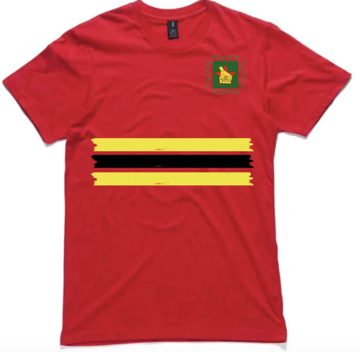
So in trying to pass time in Isolation and being stood down from work, I stumbled upon Canva and have been playing with designs. I'm no graphic designer so this template format is quite good to play with. I've already made two shirts of my own (one a band and one my own design) from it. I came up with a Zim Cricket one this week and wanted to see what you guys thought. Any feedback is much appreciated.
I hope you can click on the picture to make them bigger. I want to get feedback on what you guys thinks.
The aspect are:
1) Logo, pretty self explanatory. The green helps it to stand out but is also a reference to the green we had in our kits for a long time.
2) The green triangles are again the reference to the green from our kits, but also a reference to the triangle design from our '97 home series in which we beat England.
3) The yellow and black stripes area. play on the '99 World Cup kit
4) The back has the country name with since '92 as a reference to when we attained test status
5) The flag on the side is self explanatory and is guarded by two bats and balls to reference that this is for the cricket team, to any of those unaware.


Re: Side project feedback
Posted: Thu Jul 16, 2020 4:07 pm
by ZIMDOGGY
No offence but I think it looks too plain Jane.
The 1995/6 Australian tour one is probably my favourite but there at least one other I liked in the early 2000's. The Famous 2003/4 one is good too.
I think zim shirts look better with a bi tif black on them. Red and black works.
I'd like to see something like this next. Either with black or super dark green.
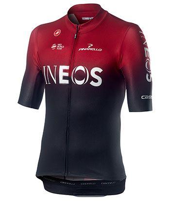
- 9507FD7C-9E47-4A7B-80FB-7EA9B0501FAE.jpeg (22.47 KiB) Viewed 2269 times
Re: Side project feedback
Posted: Thu Jul 16, 2020 6:44 pm
by foreignfield
I do like the general idea exactly because it's understated and the complete opposite of the Ketone Express jersey the Dogg posted.
The "Zimbabwe ... since '92" on the back is my favourite part; that's a really cool idea. I think I'd buy a simple red shirt with just that on the back right away

The green triangles remind me too much of the "Chevron" monicker, though. I'm okay with the yellow and black stripes but they need some graphical fine tuning (something is not 100 % right there, but I'm not a graphic designer either).
The bats and balls on the side are again a nice idea; but I'm not sure about the graphical white on red flag.
Re: Side project feedback
Posted: Thu Jul 16, 2020 10:50 pm
by zimbos_05
ZIMDOGGY wrote: ↑Thu Jul 16, 2020 4:07 pm
No offence but I think it looks too plain Jane.
It's not a kit design. It's an every day t-shirt idea, so it does not need too much happening.
foreignfield wrote: ↑Thu Jul 16, 2020 6:44 pm
I do like the general idea exactly because it's understated and the complete opposite of the Ketone Express jersey the Dogg posted.
The "Zimbabwe ... since '92" on the back is my favourite part; that's a really cool idea. I think I'd buy a simple red shirt with just that on the back right away
The green triangles remind me too much of the "Chevron" monicker, though. I'm okay with the yellow and black stripes but they need some graphical fine tuning (something is not 100 % right there, but I'm not a graphic designer either).
The bats and balls on the side are again a nice idea; but I'm not sure about the graphical white on red flag.
I did think of the Chevron thing, but the reality is that name is going to stick. I don't love it or hate it. Not sure how we get around it considering all the media outlets keep referring to us as the Chevrons. I just wanted something that harked back to the '97 kit.
The yellow and black could be because they may need to be larger, or they do not go all the way to the end of the shirt. The latter I can't do as the print company has a certain print area.
The graphical flag as in the design or the colour? Again, I'm using Canva which is template based so you do not create everything from scratch. The colour is because it matches the colour of the writing on the back.
Re: Side project feedback
Posted: Sat Jul 18, 2020 6:49 pm
by ZIMDOGGY
zimbos_05 wrote: ↑Thu Jul 16, 2020 10:50 pm
It's not a kit design. It's an every day t-shirt idea, so it does not need too much happening.
Ok that changes it a bit. It's ok for this purpose. I personally would still like to see more of a black or super dark green element, but that's me.
Re: Side project feedback
Posted: Mon Jul 27, 2020 7:59 am
by zimbos_05
So i made some changes to the front. Have left the back and side as is.