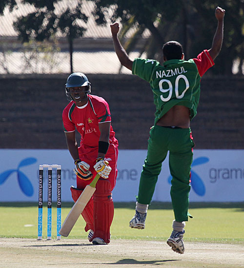
It's not my favourite strip, the first thing I noticed was how tight the sleeves were on all of the players. I thought it was interesting that the ZC logo now only appears on the back of the shirt.
My favourites were back in the Old Mutual days when there was a good mix of red and green.
brmtaylor im going to have to side with kopje on this one, this is by far our best kit! when was the last time you saw any cricket team sporting the old baggy shirts we were holding on to? it was time we got with the programme and i think faithwear did a brilliant job with the kit!
In my opinion the shirts need emergency work doing on them before tomorrow.
It's obvious that the sleeves were so tight that they stopped blood flow and caused the batsman and bowlers to perform really badly as they couldn't move their arms properly.
Agree with brmtaylor.com admin in one point, it's not the best kit but it's good. It's far better than the last one which Zimbabwe weared in the Bangladesh early this year. My favourite was that which had a Zimbabwean bird middle of the shirt and ZIMBABWE was written over that. Old Mutual kit in 2003/2004 was also nice.
Can't agree in one point...It's good that the shirt is tight. Even I like to wear tight dress. Notice the SA shirt, NZ shirt they are tight also. It's comfortable and I think it will be discomfortable if the shirts are large. It's style nowadays, you know