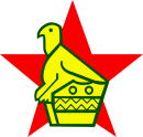
The Zimbabwean cricket logo.
A bit of background:
Sometime around 2005 when ZC went through their 'revolution' and went from the ZCU to the ZC they also went through a bit of the old rebranding.
Peter Chingoka employed his wife to design the new Zimbabwean cricket logo.
The result was the 4 box dribble that looked like was designed by a pre-schooler using microsoft paint.
Chingoka was criticised (and rightly so) for nepotism for having his wife do that design. I am unsure if she has a background in graphic design or not, but it was suspect.
Not many people liked the new logo- but there was broader issues to worry about than just a logo during this dark period.
However, i have noticed the last few months that the Zimbabwean players are using the older, more respectable bird statue thingy (also seen on the flag)they have with the star behind it on their helmets and their shirts. I for one am pleased....and hope the old one is being ditched.
Seems to coincide with the Ali Campbell involvement, things in general look alot more like 90s Zimbabwe and this could be another factor in this renaissance.
Has anyone heard anything about it or have any thoughts?
I personally think its a great logo that any Zimbok would be proud of.
Something i havent seen discussed here.
Something i havent seen discussed here.
Cricinfo profile of the 'James Bond' of cricket:
FULL NAME: Angus James Mackay
BORN: 13 June 1967, Harare
KNOWN AS: Gus Mackay
'The' Gus Mackay.
Hero.
Sportsman.
Artist.
Player.
**
Q. VUSI SIBANDA, WHERE DO YOU HOP?
A. UNDA DA ENTERTAINMENT CENTRE*
FULL NAME: Angus James Mackay
BORN: 13 June 1967, Harare
KNOWN AS: Gus Mackay
'The' Gus Mackay.
Hero.
Sportsman.
Artist.
Player.
**
Q. VUSI SIBANDA, WHERE DO YOU HOP?
A. UNDA DA ENTERTAINMENT CENTRE*
-
maehara

- Administrator
- Posts: 3986
- Joined: Wed Nov 28, 2007 3:27 pm
- Supports: Mashonaland Eagles
- Location: Ireland
- Contact:
Re: Something i havent seen discussed here.
I also recall ZC having a run-in with the police as the new logo looked suspiciously like 'MDC' from the right angles. 
Very pleased to see the 'old' logo back. Far more tasteful and eye-catching - and it is, after all, our national emblem.
Very pleased to see the 'old' logo back. Far more tasteful and eye-catching - and it is, after all, our national emblem.
-
Dr_Situ(ZimFanatic)

- Posts: 2431
- Joined: Fri Nov 30, 2007 2:14 pm
- Supports: Matabeleland Tuskers
- Location: India
- Contact:
Re: Something i havent seen discussed here.
And the following "MCD" story is quite vivid in my memoryZIMDOGGY wrote:The Zimbabwean cricket logo.
Not many people liked the new logo- but there was broader issues to worry about than just a logo during this dark period.
I agree with you on this one. I never liked the plain bat ball logo. The birdy is national pride and its so heartning to see that on the helmets/caps in the past few ODI's. It should definitely be retainedZIMDOGGY wrote:However, i have noticed the last few months that the Zimbabwean players are using the older, more respectable bird statue thingy (also seen on the flag)they have with the star behind it on their helmets and their shirts. I for one am pleased....and hope the old one is being ditched.
Seems to coincide with the Ali Campbell involvement, things in general look alot more like 90s Zimbabwe and this could be another factor in this renaissance.
Has anyone heard anything about it or have any thoughts?
I personally think its a great logo that any Zimbok would be proud of.
Zim Rules
-----------------------------------------------------------------------------------------------------------------------
Dr Satendra Singh, Delhi, India
Twitter: @drsitu
-----------------------------------------------------------------------------------------------------------------------
Dr Satendra Singh, Delhi, India
Twitter: @drsitu
Re: Something i havent seen discussed here.
I always like the old ZCU logo which was a circular emblem with two bats crossing each other, and the bird with the star behind it.
Neil Johnson, Alistair Campbell, Murray Goodwin, Andy Flower (w), Grant Flower, Dave Houghton, Guy Whittall, Heath Streak (c), Andy Blignaut, Ray Price, Eddo Brandes
-
maehara
- Administrator
- Posts: 3986
- Joined: Wed Nov 28, 2007 3:27 pm
- Supports: Mashonaland Eagles
- Location: Ireland
- Contact:
Re: Something i havent seen discussed here.
Here's a little nostalgia for you!eugene wrote:I always like the old ZCU logo which was a circular emblem with two bats crossing each other, and the bird with the star behind it.

Re: Something i havent seen discussed here.
Those were the days.
Neil Johnson, Alistair Campbell, Murray Goodwin, Andy Flower (w), Grant Flower, Dave Houghton, Guy Whittall, Heath Streak (c), Andy Blignaut, Ray Price, Eddo Brandes
-
bayhaus

- Posts: 1548
- Joined: Wed Mar 05, 2008 6:24 am
- Supports: Mountaineers
- Location: Johannesburg
- Contact:
Re: Something i havent seen discussed here.
below is a comparison of the different Board logos. The ZC logo I have to admit was a brave and progressive direction but unfortunately is half cooked and just scraped the surface on the way to a decent identity, too literal. The proportion between the type and the graphic is out. And from my knowlege it was developed by Leo Burnett, maybe Chingokas wife subcontracted them I dont think she did it personally. The Old one was a well balanced and for its time was a good enough logo. I definitely like the star and the bird.
Here is my favourite in order
1 NZ (Especially because of the way this is consistently applied in all their different sports eg rugby)
2 England (A close second)
3 Aus (Those shooting stars and the star burst is what you basicall expect when playing Aus - fireworks!)
4 Ind (Not sure what that is but works well when applied eg on the helmet)
5 Pak (Its a star)
6 Zim (Its definitely MDC Zimbabwe!)
7 SA (Looks unresolved same league as ZC)
8 Sri ()
9 Bangladesh (School blazer type of badge)
10 WI (Now there is a kids drawing!)
- Board Logos Of the 10 countries
- Logods.jpg (81.28 KiB) Viewed 1749 times
1 NZ (Especially because of the way this is consistently applied in all their different sports eg rugby)
2 England (A close second)
3 Aus (Those shooting stars and the star burst is what you basicall expect when playing Aus - fireworks!)
4 Ind (Not sure what that is but works well when applied eg on the helmet)
5 Pak (Its a star)
6 Zim (Its definitely MDC Zimbabwe!)
7 SA (Looks unresolved same league as ZC)
8 Sri ()
9 Bangladesh (School blazer type of badge)
10 WI (Now there is a kids drawing!)